Dirt + Water
Rocky Mountain Clay was in need of overhauling Design and E-Commerce marketing
to boost sales, achieve business metrics, and to enhance curb appeal.
My Story at Rocky Mountain Clay
As a manufacturer of pottery clay and supplies, Rocky Mountain Clay was a whole new world for me - a niche industry where I had no previous experience. Clay is messy and fun, but clay in the raw form (dirt + water) is not very sexy or appealing… My goal was to sell the vision not of buying clay, but of the limitless possibilities of what someone might create by using our clay. Here’s what we achieved:
| Sales: + 114%
| Site Visitors: +70%
| Orders: +170%
| Conversion Rate: +6%
| Sales: + 114% | Site Visitors: +70% | Orders: +170% | Conversion Rate: +6%
Identifying our Persona
From the elementary art teacher to the professional potter, our target audience includes a wide range of ages, background, and demographics.
My goal was to empathize with our customers and to design a user experience that could cater to the novice and the professional, the tech savvy and the traditionally analog.
The Good, The Bad, and The Ugly.
Objective: Our company was in major need of an e-commerce overhaul and a revamped digital presence. On top of crafting a vastly improved and simplified user experience, how can I to make blocks of raw clay have more visual appeal?
__________________________________________________________________________________________________________________________________________
The Good: Searchability, had placeholders for improving copy
The Bad: Menus/Navigation, hierarchy, Disorganization, User Flows and Check-Out flow
The Ugly: Website UI and brand continuity, visual content, Finding a way to make blocks of raw clay and sample tiles have more visual appeal


Research and Design Decisions
-
Main Menu and Categories.
Broad categories not easily accessible.
Customers preferred brands when shopping
Design Decision: Introduce large-style, color coded category buttons
Within each category, emphasis on brand as a navigation starting point.
-
Description text: Too small/thin, lots of elderly customers made comments about accessibility and legibility.
Poor contrast and distinction between visual hierarchical elements, which led to difficulty reading.
Design Decision: Choose a title and a body typeface that worked cohesively but provided contrast among text
-
The website was very green and homogenous, no contrast or landmarks. Led to lack of recognition and muddled navigation.
Design decision: Color coding product categories, increased hierarchy and contrast, improved organization.
-
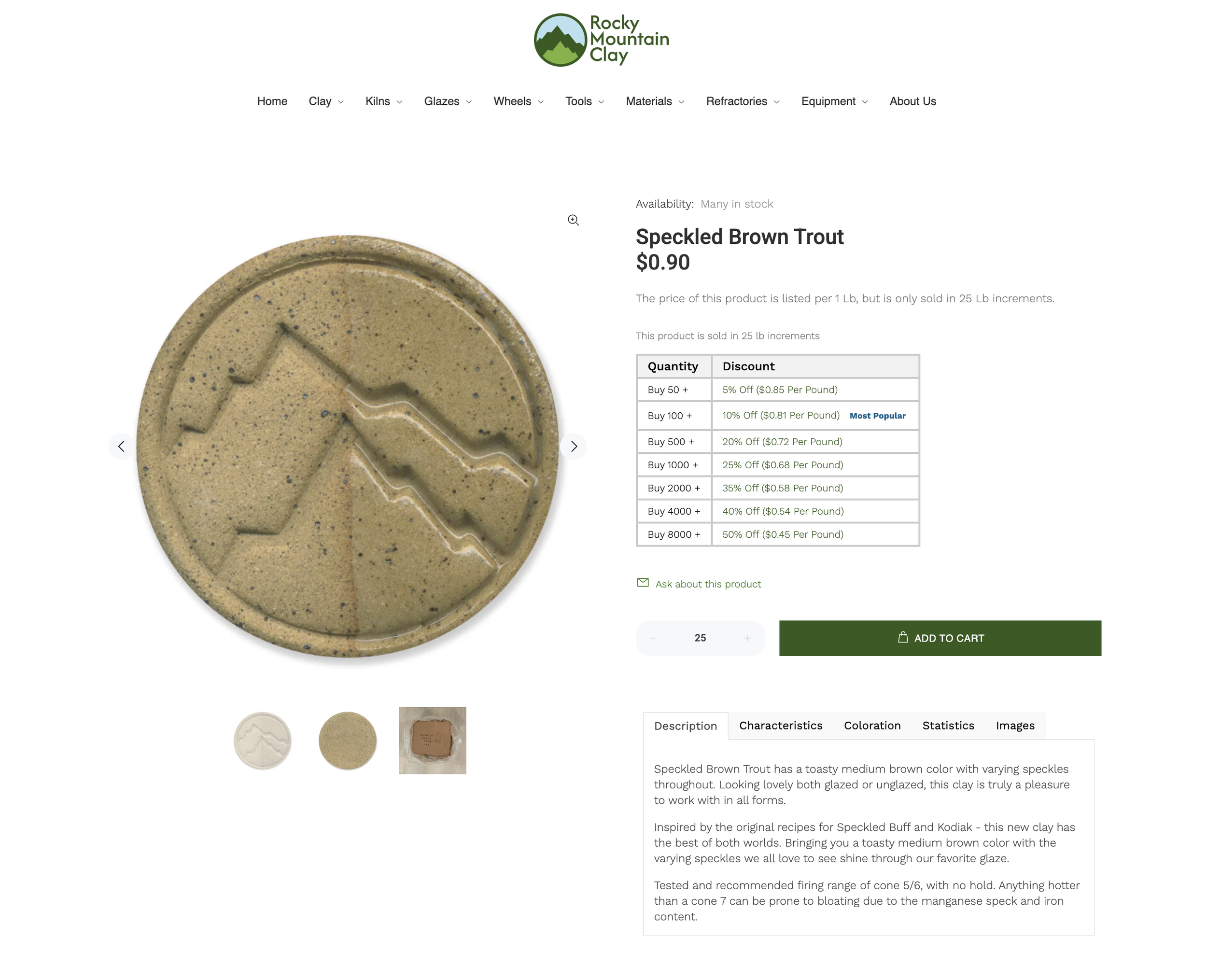
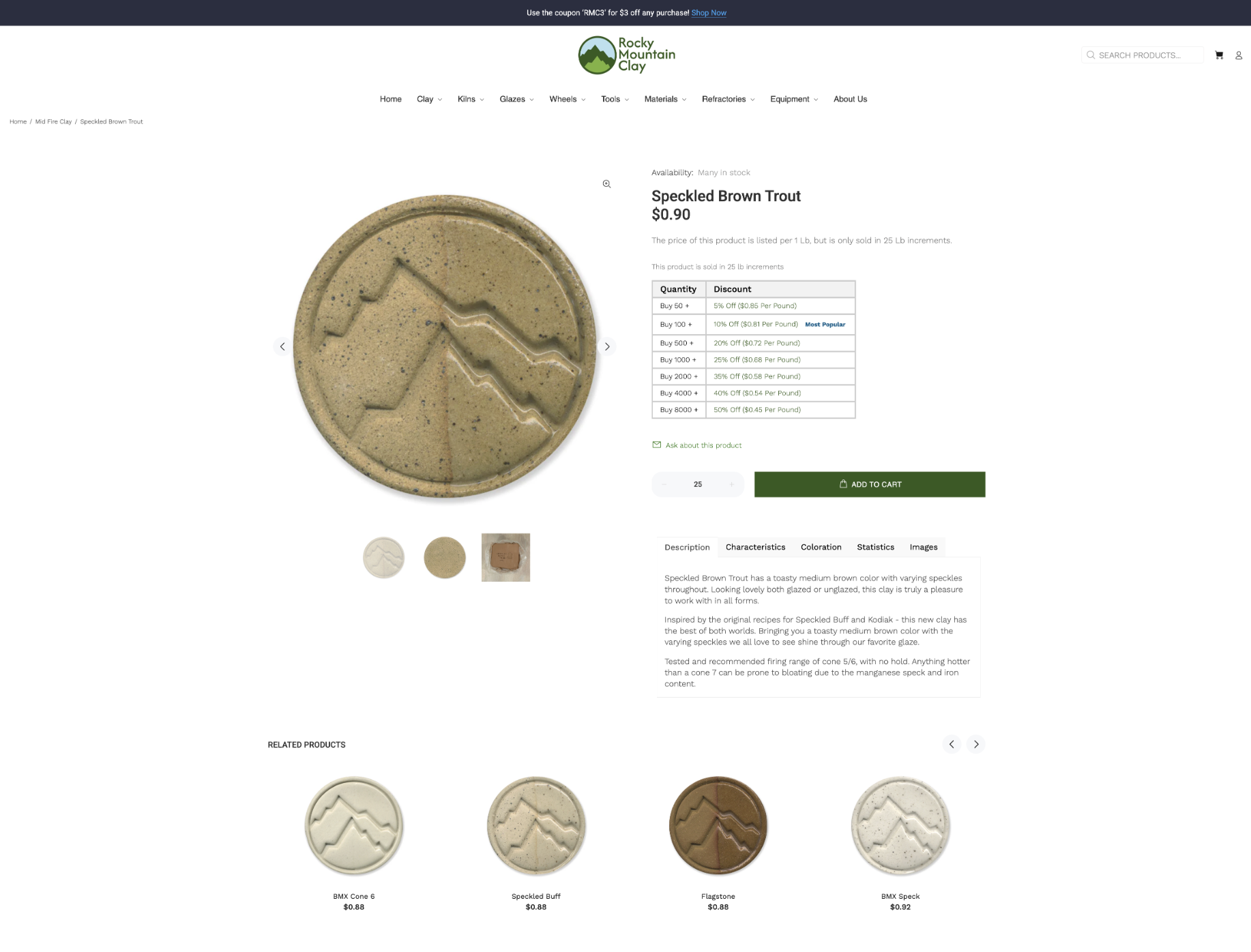
○ Kilns - made to order vs. in stock pages - separate pages synced to Quickbooks for quicker updating and more accurate inventory count
○ Specification selections and shipping options available via product page
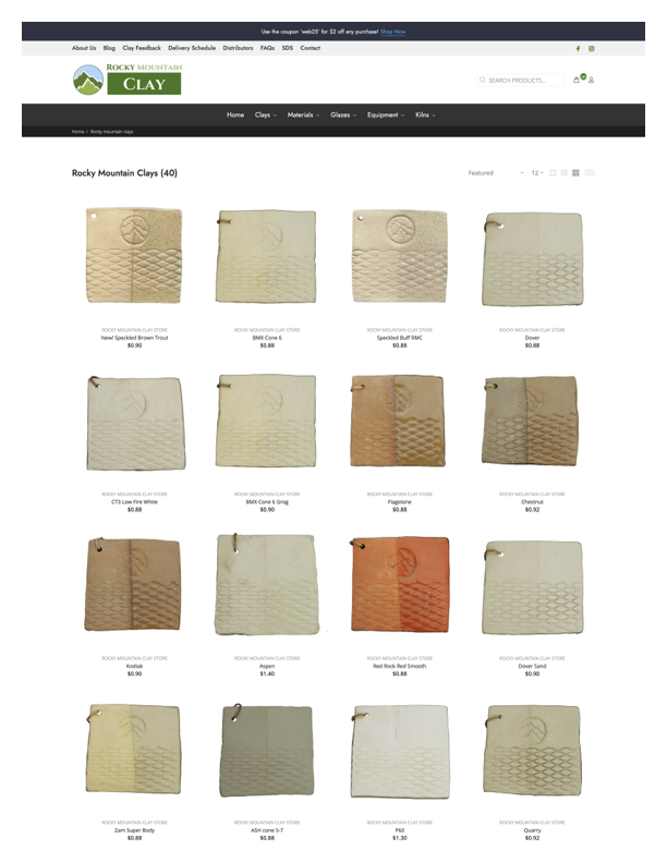
○ Product image uniformity - improving clarity and standard image size site wide
○ Format for displaying Clay images
○ Naming conventions standardized both on web and in internal data storage systems
○ Standardized image carousel (Tile 1, tile 2, back of tile, etc.) for improved broswing experience
-
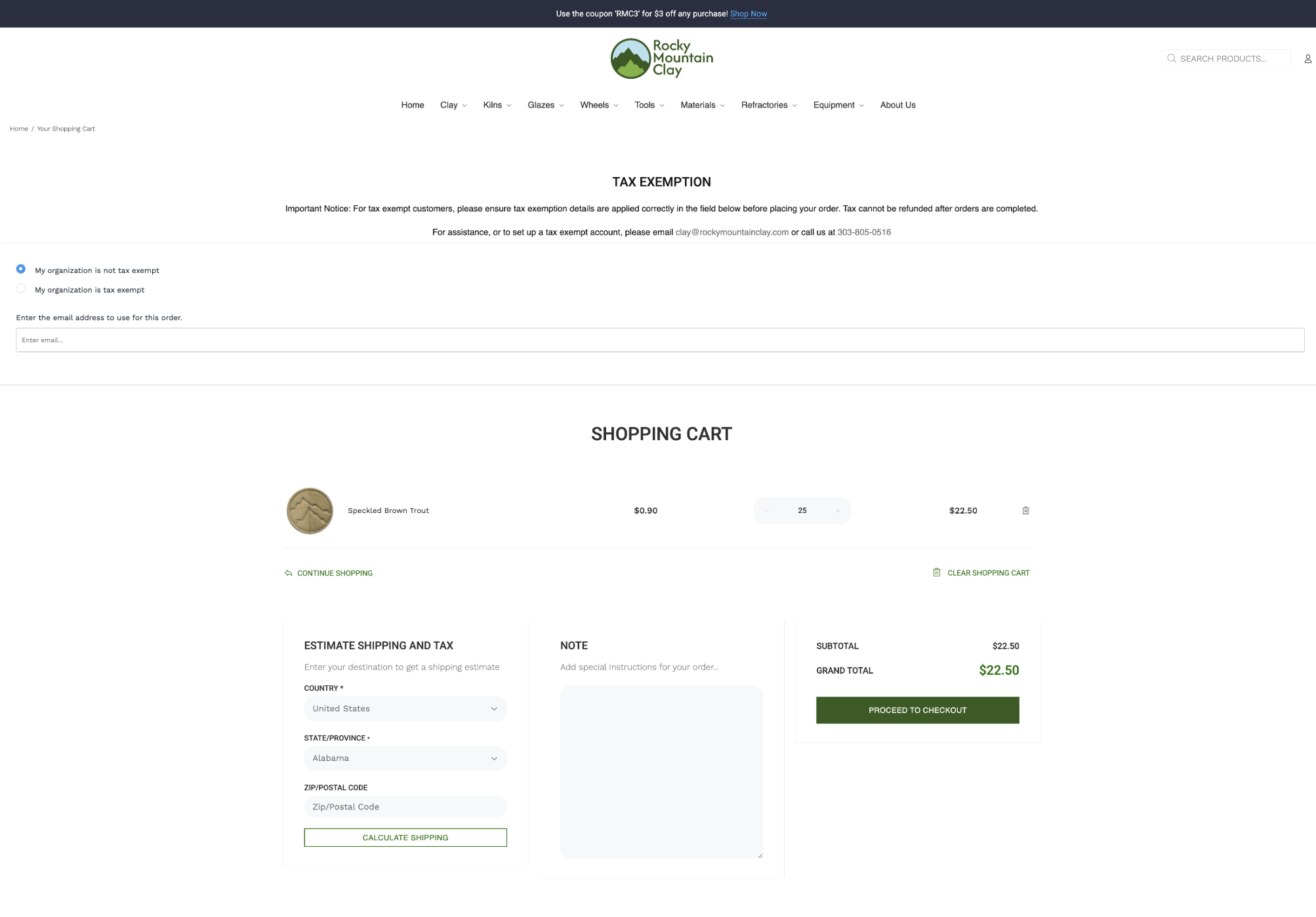
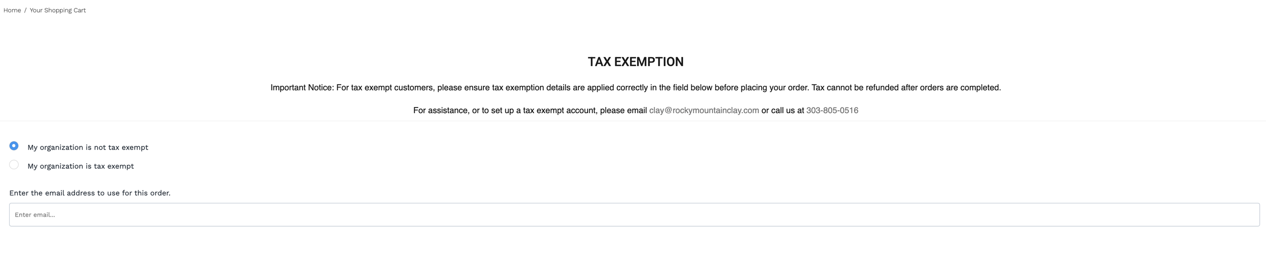
As a business, we collect tax exemption documents from the state of Colorado before we can issue a tax exempt status toward any customer.
This can often get tricky with the uploading of a variety of documents.
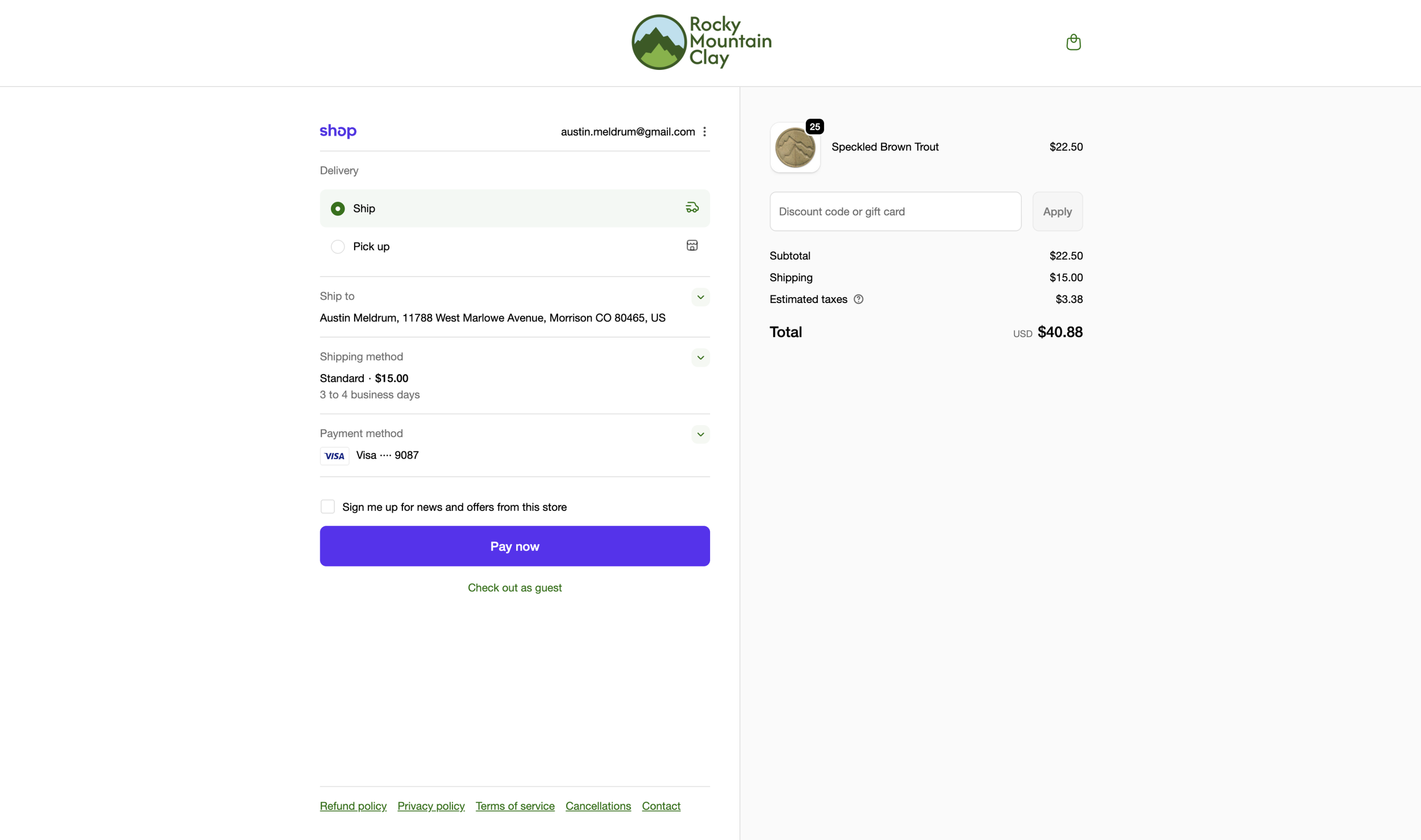
Shipping charges were another pain point.
Design Decision: Auto population of shipping charges in cart, not final check out page.
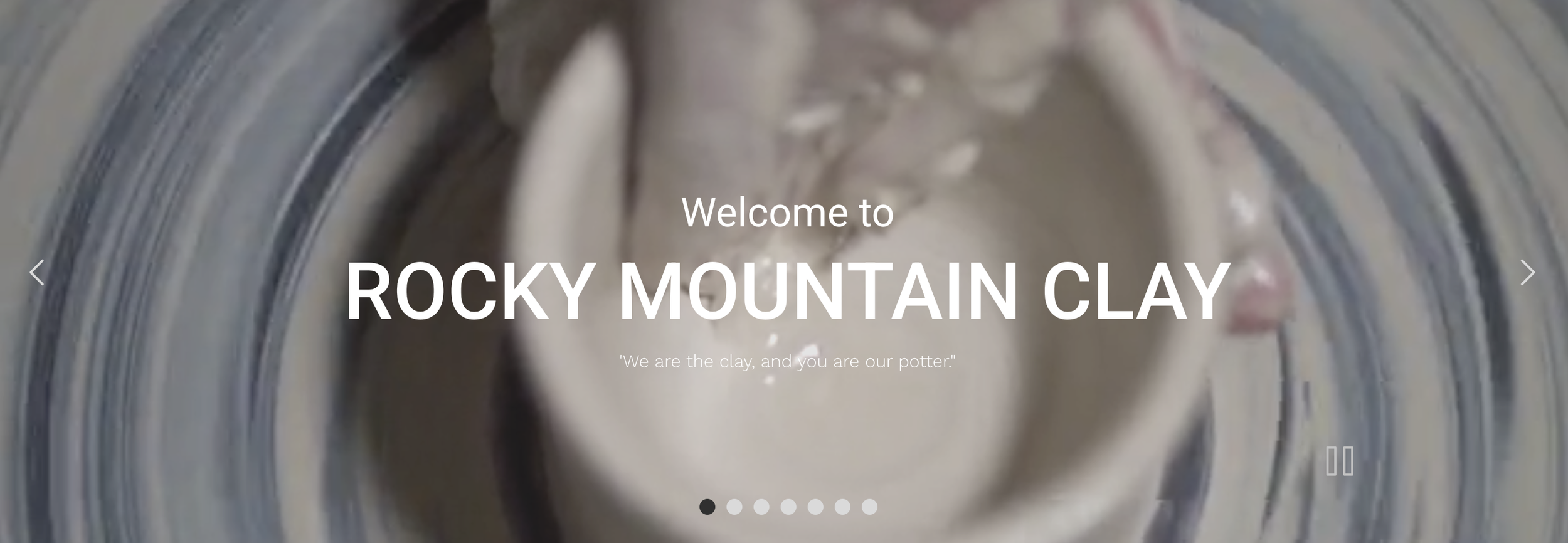
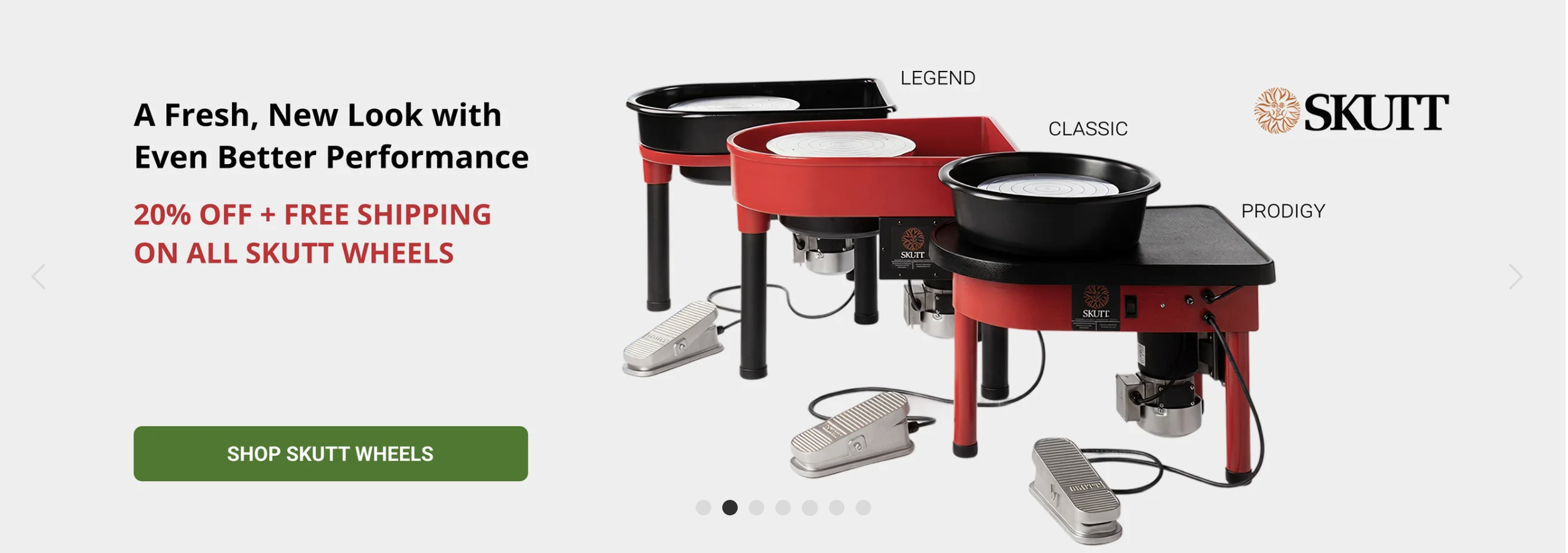
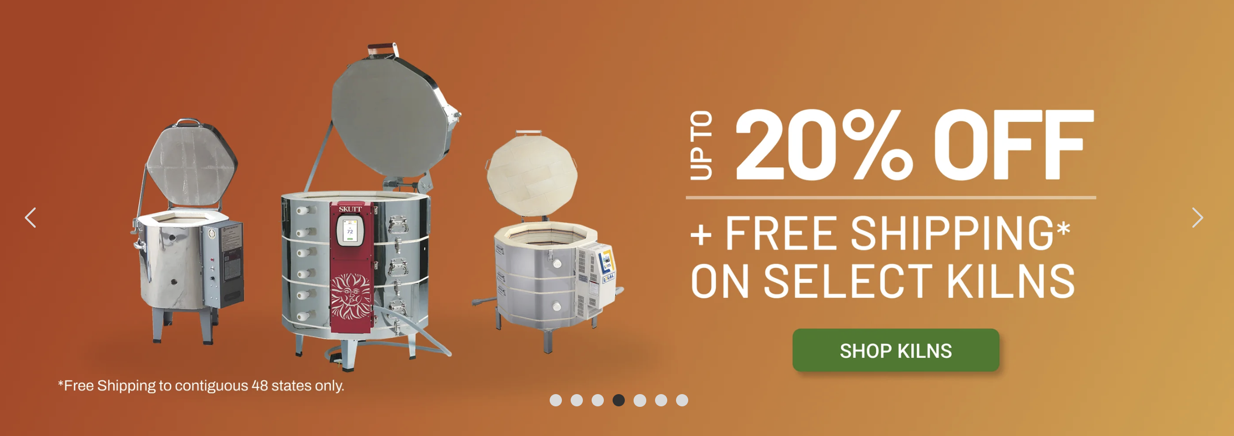
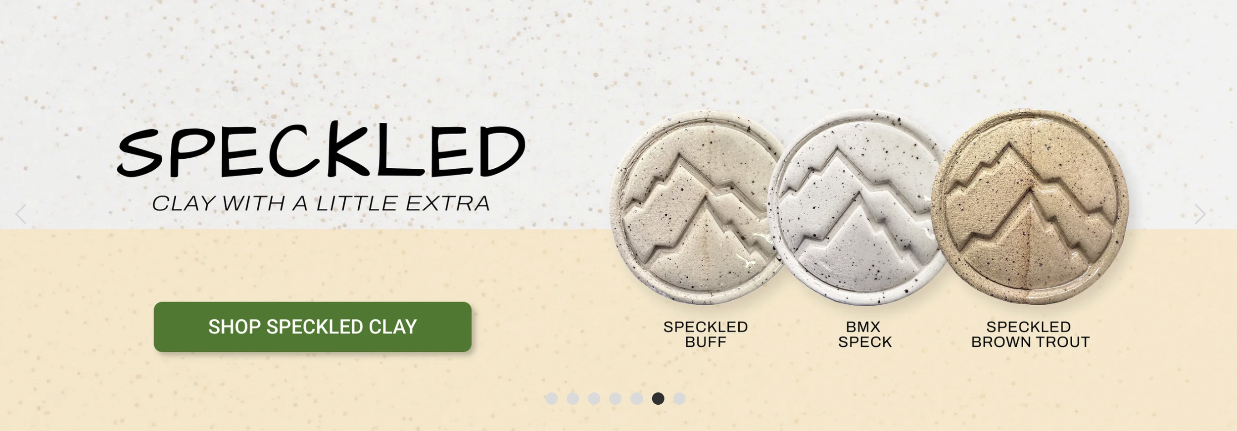
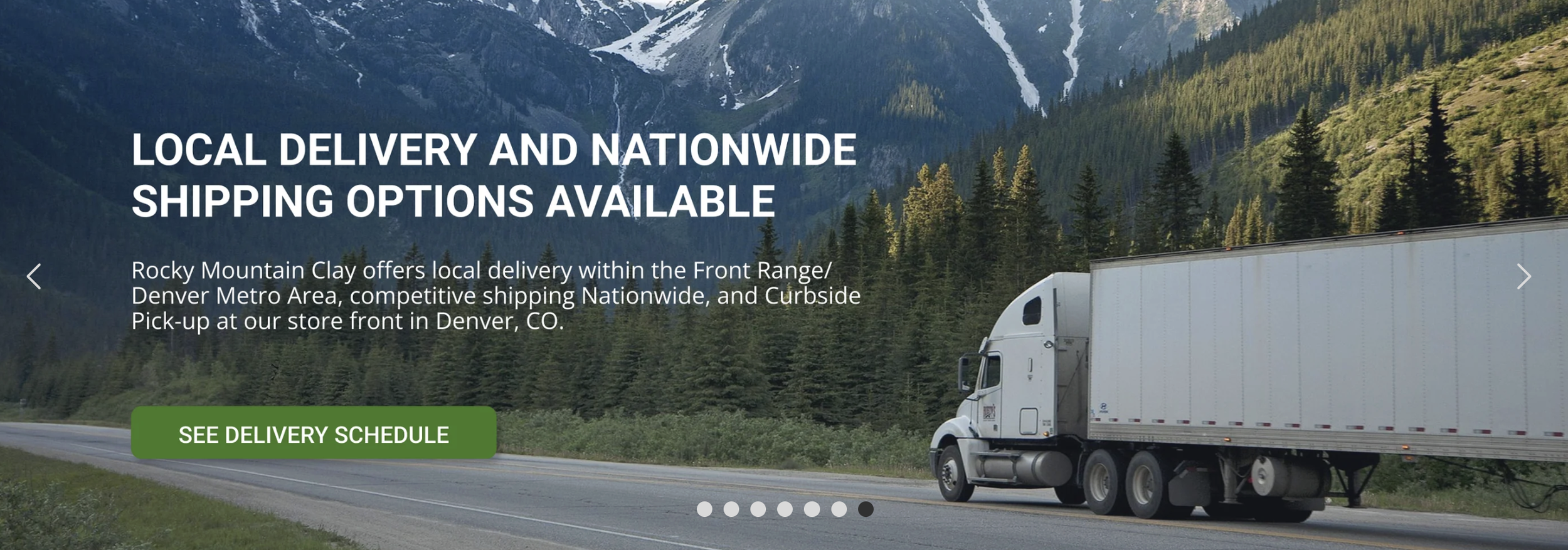
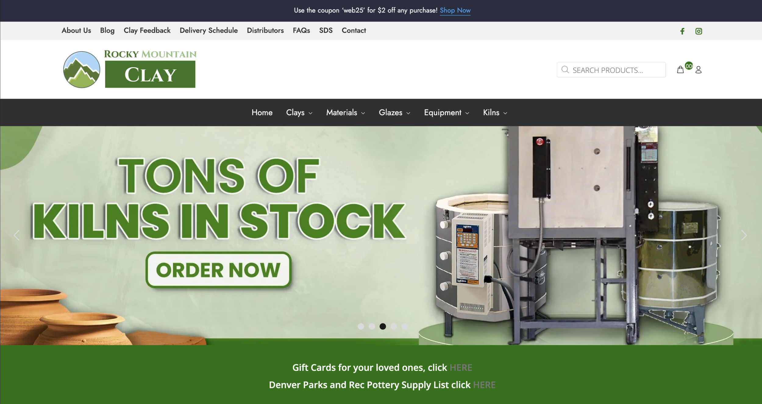
Homepage & Ads Carousel
We can’t sell what can’t be seen
A major component on any e-commerce website, our home page and banner ads were muddled, incoherent, and lacked pertinent information. Aside, RMC wasn’t utilizing the design element to maximize visibility, keep customers up-to-date with sales and promotions, and assure customers of pertinent information regarding large purchases
Goal: Overhaul the banner ads to include more up-to-date sales needs in a more visual and distinct form.
Result: Focusing on Kilns, Pottery Wheels, Specialty Clays, and our competitive shipping/delivery rates, I crafted a rotating of carousel with brand-promoting videos, and appealing banner ads to give visibility to the products we wanted to sell. As a result, sales on high-price point items (kilns and pottery wheels) have increased, we sell through speciality items quicker, and we received fewer phone calls with customer questions regarding shipping delivery, thus freeing up employees to give attention to other, more pressing, matters.
Product Pages, Hierarchy, and Navigation
Assure user when shopping for complex or high-price point items
Making all product easily discoverable was priority #1. Like i mentioned earlier, we cant sell what isnt visible. RMC has large inventory of similar items, so making specific products searchable was paramount.
In addition to clay, Rocky Mountain Clay also sells kilns and pottery wheels. These items typically have a higher price point and can be complex purchases due to home electrical set ups, fire-safety regulations, and shipping/installation services. Existing product pages had lacked consistency and depth of information
Goal: Create a product page that was consistent is design, informative regardless of product type, sufficiently detailed, yet simple to read.
Result: I designed an overarching product page template that included more rigid photo dimensions (for improved visual consistency), a tabbed info box design element to quickly display an array of information without overloading the user, and implementation of tags and metafields to show customized data pertinent to individual products.
Lastly, I focused on revamping our main menu navigation to start from a broader category (clay, kilns, wheels, etc) and then filter by brand.
Checkout Flow
Clarity: Quantity, Shipping Rates, Tax Exemption, Bulk/Volume Pricing
Goal: Create a product page that was consistent is design, informative regardless of product type, sufficiently detailed, yet simple to read.
Result: I designed an overarching product page template that included more rigid photo dimensions (for improved visual consistency), a tabbed info box design element to quickly display an array of information without overloading the user, and implementation of tags and metafields to show customized data pertinent to individual products.